


How to make graffiti alphabet with Photoshop Text Effects? The following is a tutorial on how to create graffiti with Adobe Photoshop:
1. You ready for this. Keep up, there's a lot to cover. First, create a new document. I chose a banner size.
1. You ready for this. Keep up, there's a lot to cover. First, create a new document. I chose a banner size.
 2. Choose a brick color such as the one in the picture. Fill the background layer with this color.
 3. (Filters/Filter Gallery/Texturizer)
Choose brick, top left lighting. Make the bricks look big enough. Click ok.

 4. Select the type tool. Type something. Choose a graffiti looking font like TagsXtreme. I think I got this font from the 1001 free fonts website.
5. The worst part of any tutorials… layer effects!!! I could type them out, but that's too much work, so here just download the style and look for you self. Remember that these effects were created for the size of the image I used. You may notice a difference if your image is much larger, or smaller in size compared to mine. graffiti.asl
6. Duplicate the text layer. Link the text layers and combine them. This will flatten the layer effects. Tell me, why isn't their a command to rasterize layer effects?
7. Ad more layer effects. I chose a simple outer glow. Then ad a sharp drop shadow for that cartoonist effect. This style was also in the styles file in step 5.
8. If you want that paint dripping effect that we see so often, Filter>Liquify. Use the forward warp tool to push the graffiti down, then use the bloat tool to make the “paint” bulge like its dripping as you can see in the final image on the bottom of the R and I.
9. Create a new layer above the rest. This is your highlights layer. Create little highlights on the top left of the paint drips, and make little cartoonist starbursts at the corners of the graffiti. If your lazy like me, you will create a single star burst and then just duplicate the layer as many times as needed.
10. Finally reduce the fill so that some of the brick wall shows through. Somewhere between 70 and 90 should look good. I'll let you be the judge.
Important note: A certain Mr. Tyler suggested to change the blend mode of the text to overlay. Thank you Tyler, all suggestions are welcome and help us all. I appreciate the input.
 Extra Step: I duplicated the graffiti layer and merged them to rasterize the layer effects, the performed Filter>Texturizer>Brick with the same settings as before on the graffiti layer. Then I hit Edit>Fade Effect and reduced the opacity a bit. It looked like this. [Via]
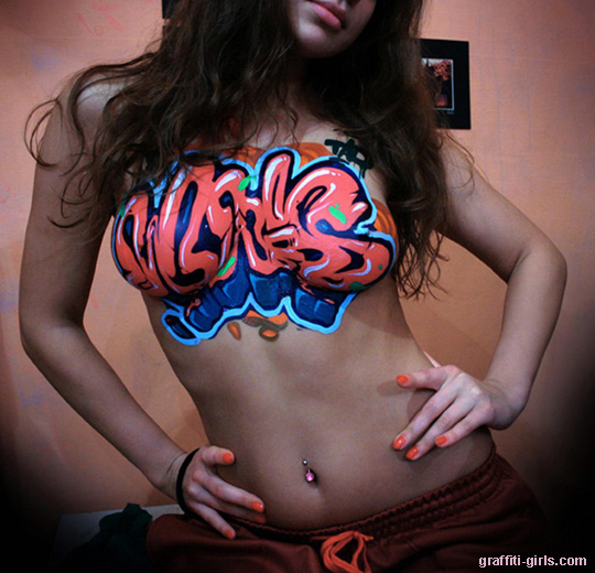
Graffiti Art


